Design Direction.
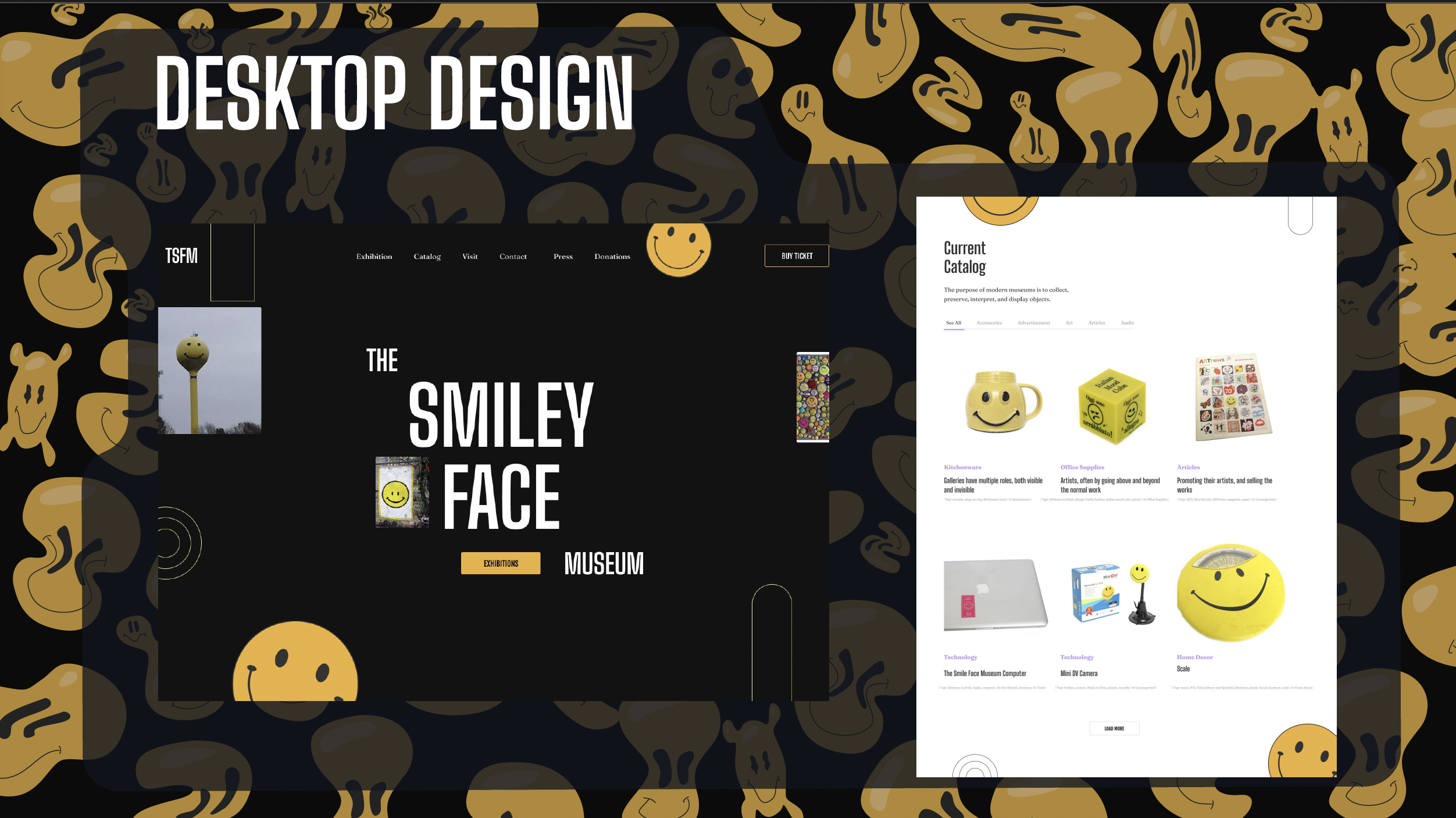
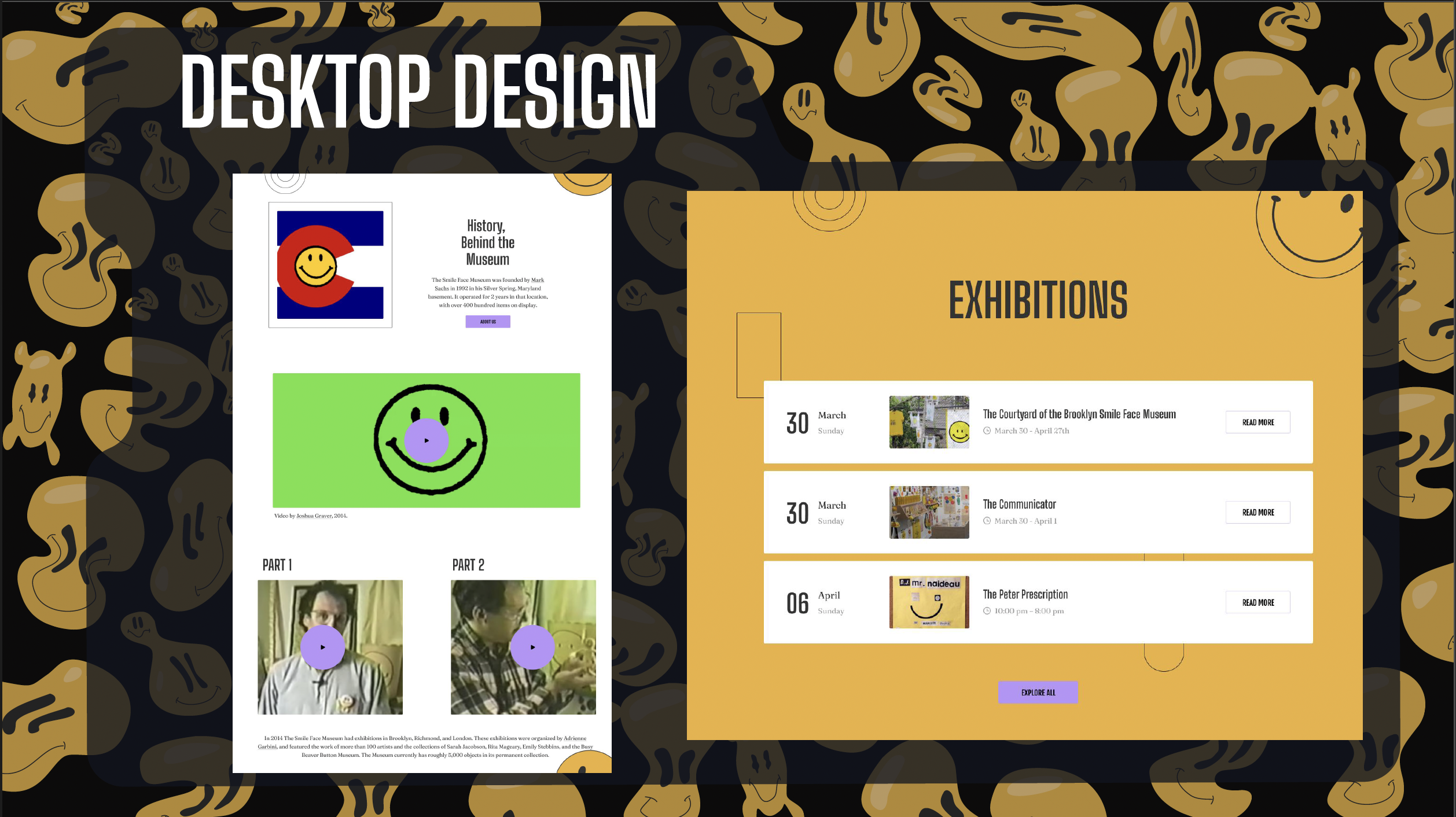
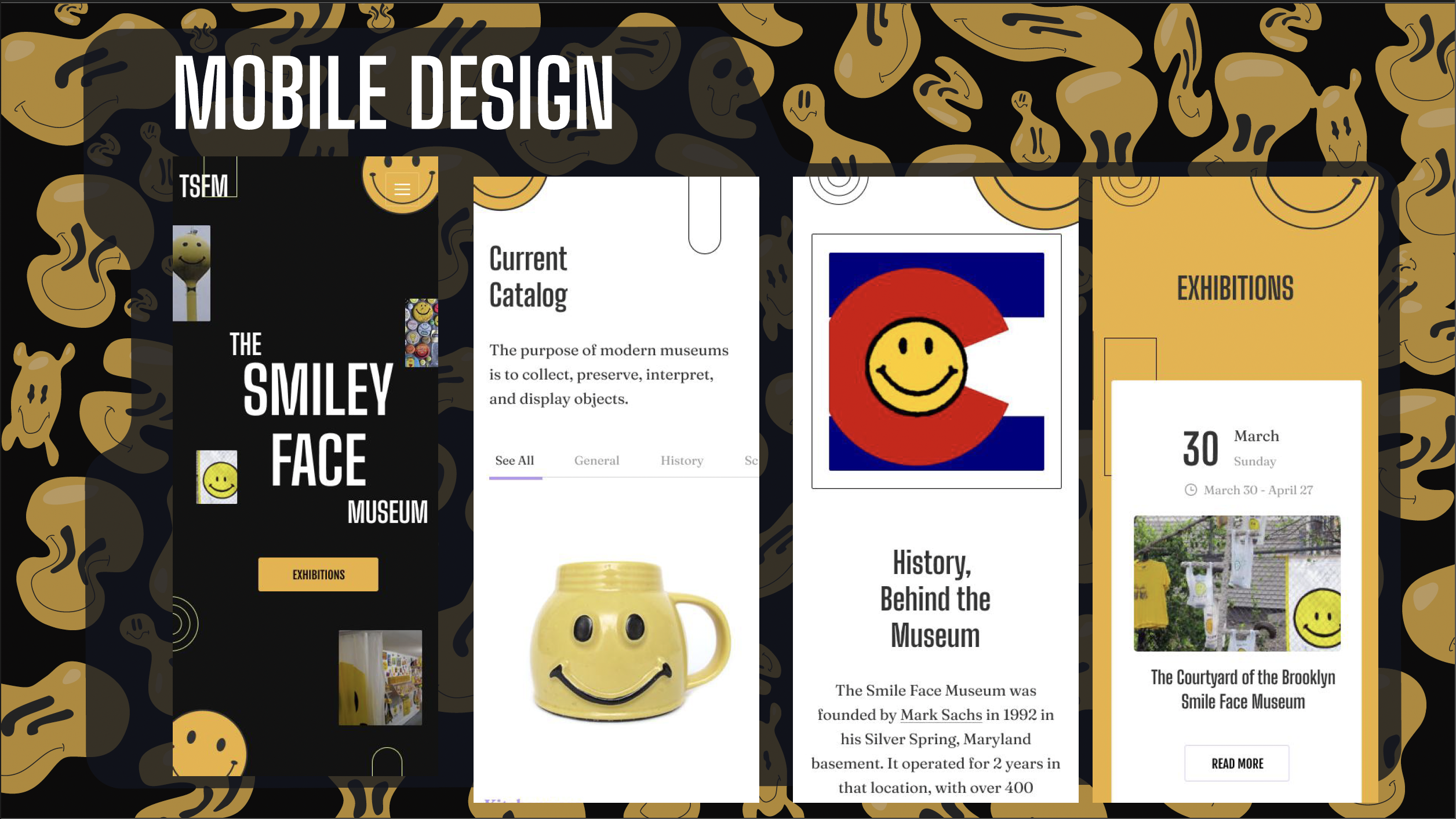
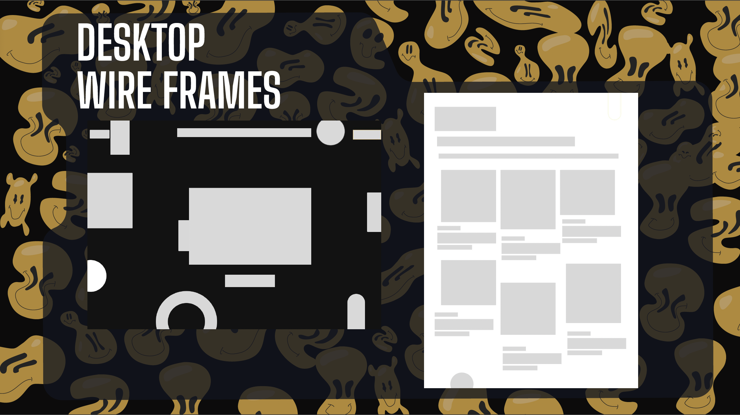
I started with wireframes for four to five key pages — each designed in both desktop (1440px) and mobile (375px)viewports to keep the energy consistent across screens. The homepage was expanded into four view sizes (extra-wide, desktop, tablet, and mobile) to explore how playfulness could adapt responsively.The design language centered on:Expressive Typography: Oversized headlines, distorted letters, and bold sans-serifs that echo sticker art and early web graphics.Vibrant Colour Palette: A clash of yellow, electric blue, and acid pink — chaotic but controlled.Textures + Patterns: Grain, gradients, and retro smile icons that created depth and imperfection.Microinteractions: Playful hover states, bouncing icons, and subtle motion that made every click feel intentional and alive.


.svg)